
Phase One
- Feb 9, 2020
- 9 min read
Updated: Mar 16, 2020
Thinking, fast and slow.
Advertising and marketing used to be based around designing an image.
Advertising is more sophisticated now. It is based around human interaction and behaviour.
We will explore the ways in which communication can change behavior and the creation of digital products. You will also learn to work in a team.
Part 1 - Discussions on change
You will design the identity and launch materials for a conference on behavioral change that will take place in the walker space.
Part 2 - Action for change
You will develop a digital product or service that will benefit users and help with management of a medical condition. You will name and brand it and create a digital launch campaign.
Phase One.
Design for change
Altering perception and behaviour in digital and physical space.
Product launch and talks by industry professionals at Walker Space in Ravensbourne University.
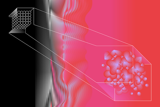
Behavioral economics
A sophisticated manipulation of our instinctive behaviour is increasingly being used to influence our decision-making.
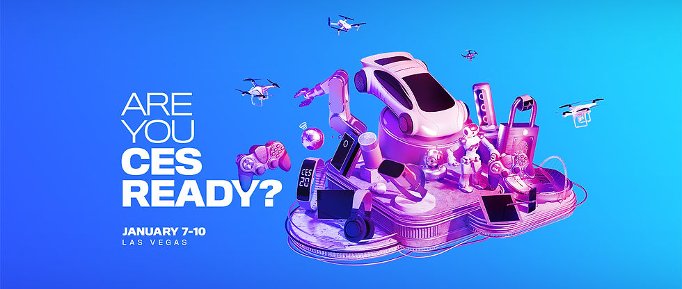
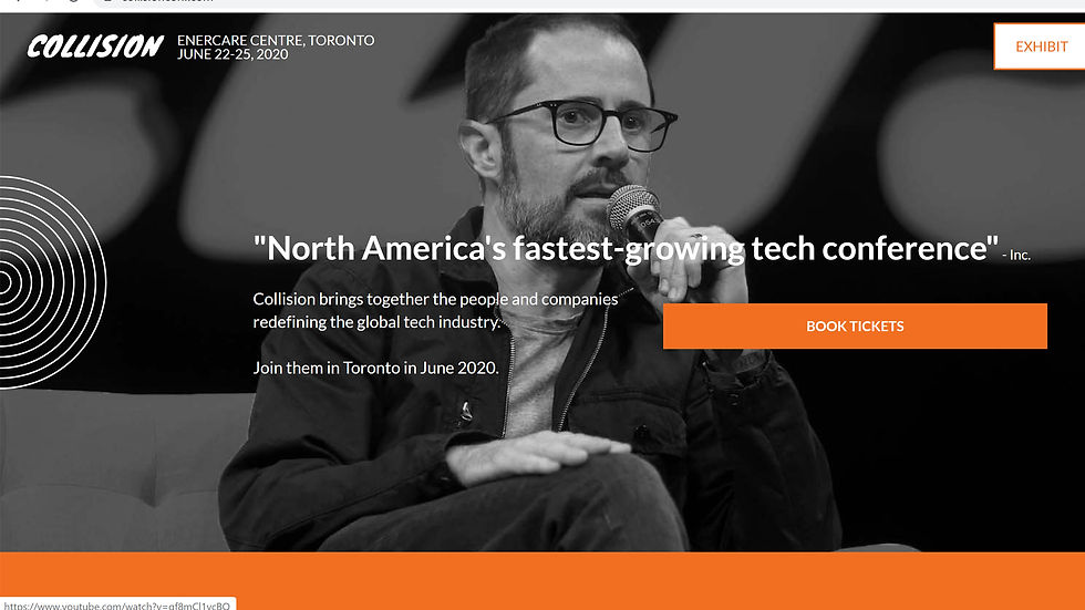
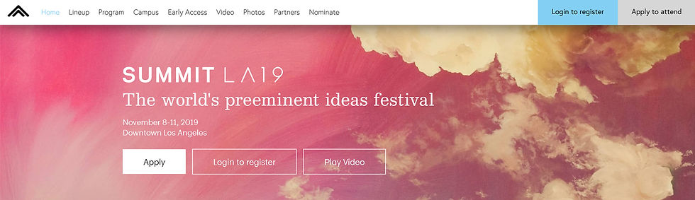
Find examples of nudge/behaviour change in advertising.
Cadbury x Age UK – Donate your Words
There's a crisis in the UK. 1.4 million older people struggle with loneliness. 225,000 often go a whole week without speaking to anyone. Cadbury are donating their words from their bars to help, with 30p from every limited edition bar sold going to Age UK.
Apple - iOS 13 lives in the dark
iOS now lives in the dark. A cool new look that’s easy on the eyes and perfect for low-light environments. Coming Fall 2019.
YouTuber MrBeast's tree-planting campaign reached its goal of raising $20 million by 1st Jan 2020.
Get people to be more aware of charity and donating to helpful causes on a large scale.

Discover the "Seven Worlds" behind each drop of Hennessy X.O through a multi-sensorial and interactive experience at the X.O Odyssey pop-up:
Take a picture at one of the interactive photo booths and become the character of one of the Hennessy X.O Odyssey movie scenes.
Smell the Hennessy X.O tasting notes as you walk through the "Seven Worlds."
Discover the Seven Worlds through unique food sampling that relates to the tasting notes (customized lollipops, chocolates and spicy marshmallows).
Engrave your Hennessy bottle to make it exclusively yours. (available for Hennessy XO and Hennessy X.X.O)

Ideas/ insights that could form the basis of an identity for a conference on behavioral change.


Kin Design - D&AD
Working with the concept of optical illusions and utilising micro and macro scales we created a range of graphic work for all three events. We applied the scheme across a full spectrum of media: invites, programmes, web assets, posters, flags, vinyl, hanging signs, floor stickers, notice boards and wall super graphics.
The work extended to creating a series of interactive tables with nominated work shown on embedded touchscreens, and a dancing, sound reactive video with specially commissioned music.

Kin Design - LCF
Kin Design designed a multi-faceted shape that split off into fragmented parts to represent each individual school. Using these shapes we created a set of display furniture, a way-finding system and a hanging light sculpture to give the space and display systems a sense of presence.
The light sculpture was designed so that, when viewed from a certain angle, the many parts came together to reveal the original whole shape. Taking over the main corridor, this presented the show identity as a bold backdrop for social media photos.

Kin Design - Urban Innovation Centre – Future Cities Catapult
To create the immediate impression of activity they guided visitors through the space with a lighting installation showing animating text, video and live data streams.
The main exhibition space showcases Future Cities’ projects and goals, taking inspiration from the evolving and fragmented nature of cities. The five unique display structures and welcome wall are designed as a flexible environment that can adapt to accommodate the Catapults’ changing requirements.
To enable presentations, and digital demonstrations we created an interactive table that links to a large video wall. They created a series of objects that could be placed onto the table to unpack project stories.
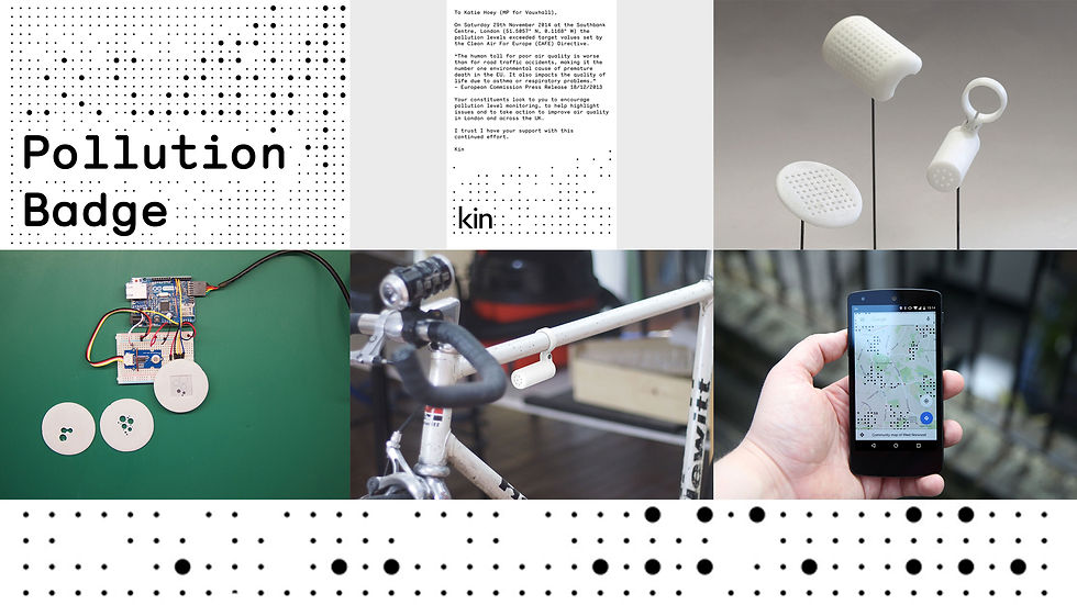
Kin Design - Pollution Badge
The Pollution Badge monitors local environmental conditions to check whether pollution levels are getting too high. If they are, an email is drafted, via a paired smartphone, to the relevant Member of Parliament. Tagged with metadata the statistics can also be used too usefully contribute to community generated pollution maps.
They developed a collection of prototype objects focusing on specific contexts. These prototypes can be attached to bikes to provide road specific information and cover a wide area, or strapped to a buggy to monitor low lying pollution that particularly affects infants.
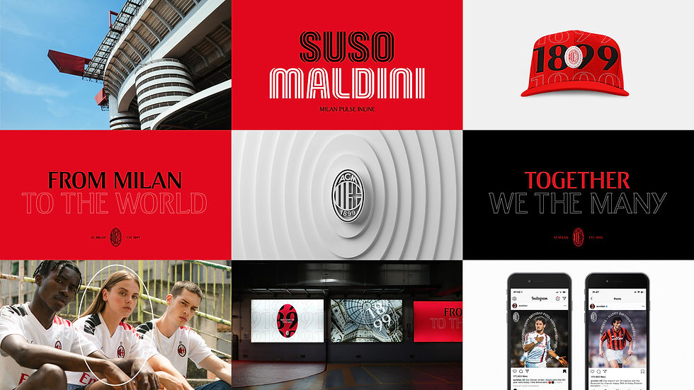
Dixon Baxi - AC Milan
Creating a bold new vision for the iconic AC Milan. Rooted in the history of 120 years while looking to the future, and giving new meaning to the badge for over 450 million fans globally.
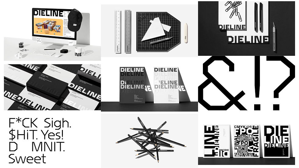
JKR - Dieline
To call Dieline a packaging blog doesn’t do it justice. Dieline creates original content, runs a global design competition and hosts an international conference annually. What was missing was a brand that captured the scope and clout of the platform—and the community it serves.
The identity is inspired by the packaging process itself—from sketches and concepts to design, production and beyond. Defined yet undefined, Dieline as a source of endless possibilities.

JKR - Social Mobility Foundation
Simply stated, social mobility is the ability to move freely between different levels of society. They created the identity to move freely as well—running and jumping to visually communicate the SMF mission to provide upward mobility for young people.

Non-Format - Only Connect Festival
Program and poster for the 2017 Only Connect Festival of Sound organised by nyMusikk, the leading promoter of contemporary music in Norway.
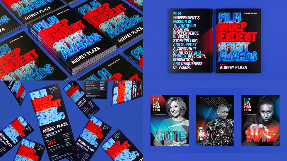
2019 Film Independent Spirit Awards
The graphics are built around the custom typeface Font Independent, which is used across all of Film Independent’s programming. As in previous years, the graphics were fully integrated into every aspect of the event––from the voting cards sent to Film Independent members, to the design of the set, tent graphics, tickets and programs, to the animations playing across screens and on the broadcast, to the promotional campaign––creating an immersive experience.
This was amplified by the set design, which extended the 3D look with a series of screens filled with ambient animations during the ceremony. The screens created virtual spaces that played with depth and perspective, transforming throughout the show by appearing to dimensionally expand and recede into space.

Ken Meier
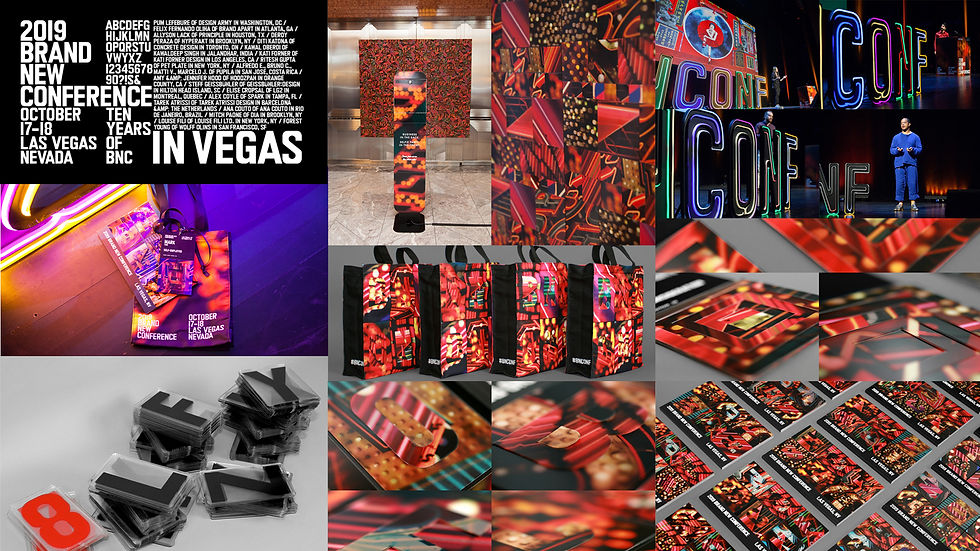
UnderConsideration LLC - 2019 Brand New Conference


Jessica Walsh - Aizone
Aizone is a department store in the Middle East. For Aizone's campaigns, she sought to create imagery that would stand out in the Middle Eastern market and get people talking about the department store. The campaign spanned many years, and was very successful.


Jessica Walsh - Contemporary Art Museum
We created the The Aldrich Museum's brand identity in addition to environmental graphics and an ad campaign, inspired by the progressive upwards arrow from the museum's architecture.
The Aldrich Contemporary Art Museum advances creative thinking by connecting today’s artists with individuals and communities in unexpected and stimulating ways.

Adobe Max

Spotlight festival
______________________________________________________________

5 Senses
27 Emotions


Brain Scans.


Think Fast.

Thinking, Fast and Slow.

Of Two Minds.


Wall of Inspiration
Define
Anchoring with clearly defined behaviours that we need to change. We isolate the difference between behavioural causes and effects (campaign and resulting purchase behaviours). Often it is easier to define an incremental behaviour than a switch one: "Try something new today" is a perfect example of an incremental behaviour-change campaign and had enormous impact for Sainsbury’s. With a clear definition of the change required, ideas can be developed. The best tend to share three common characteristics:
Connect
The ability to emotionally engage. Fundamental to advertising effectiveness, this is vital to behaviour-change campaigns. People are emotionally inspired or compelled to change behaviour, rather than rationally persuaded. Look no further than John Lewis doubling online sales at Christmas. Highest-order creativity is the imperative to change behaviour, not just desirable.
Enable
Remove barriers and find motivational triggers. By understanding underlying causes of existing behaviour and barriers that are in play we can identify potential triggers to change them. The easier, quicker, more personally or socially rewarding campaigns are, the more they will incentivise, attract and engage us.
Activate
Timely deployment of place, time and context. It is essential not to waste hard-fought emotional engagement and behavioural triggers at moments when people can’t or don’t want to do anything about it. Effective planning of the customer journey delivers emotive brand engagement at a time when people can and want to engage.
Whether it be organ donation, retirement contribution or buying a biscuit, successful campaigns for behaviour change tend to share these four components of define, connect, enable and activate.
Interaction and Participation for change
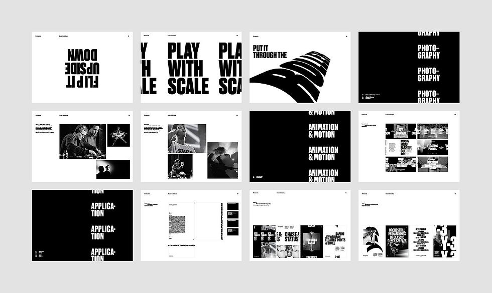
Conference identity design.
Research
Insight/idea
Execution
South By South West Festival.


OFFF TLV


Brand Identity guidlines
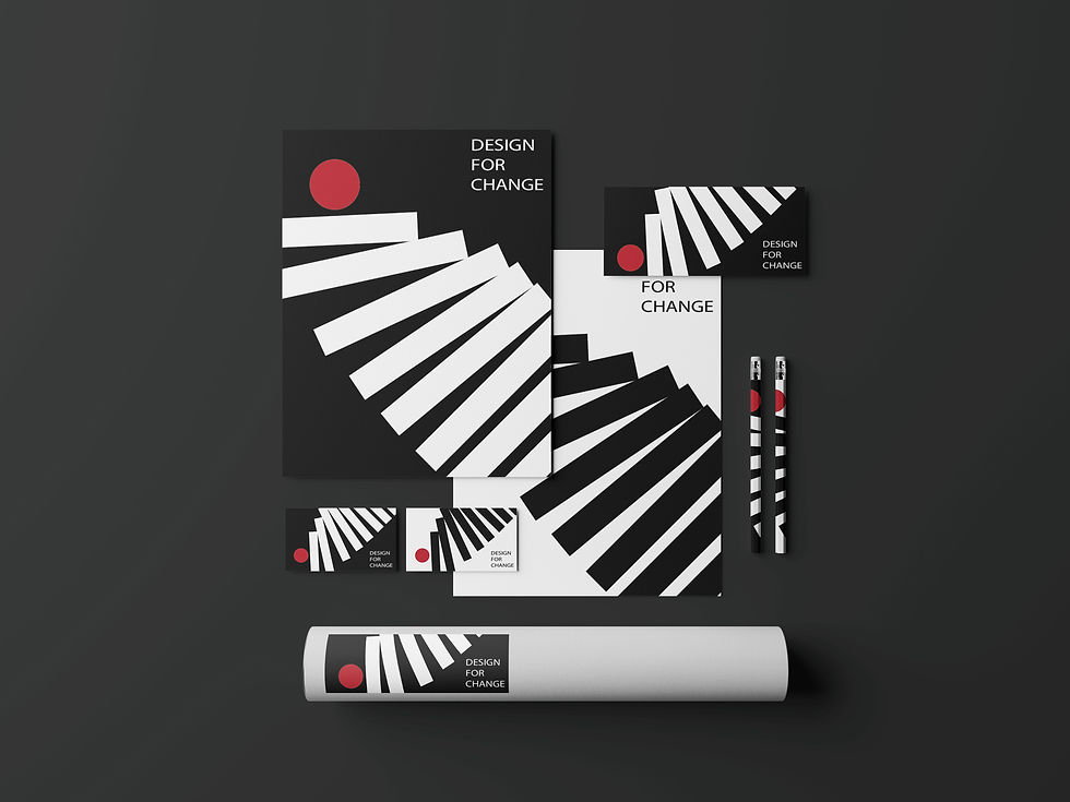
DESIGN FOR CHANGE 2020
NOTES:
Possible problems relevant to today we could think about:
Environmental
Social media
Mental health
Creative process
- being stuck in two minds
- comparing yourself/your work to others
Common design elements used to influence behaviour:
-colour
-lights
-suggestions
-ux/ui design
INITIAL INSIGHTS
Too much of anything is a bad thing
technology isnt bad, using it too much can be - balance.
Getting past creative block - stuck in two minds
The only thing stopping you is yourself
The only way to get through it is to do it
Too much choice can be paralysing (the tyranny of choice)
Kinetic typography example
Insight 1: Changing behaviour is a choice.
ALL IT TAKES IS ONE person to create change on a global scale. Eg. Greta Thunberg.
ideas:
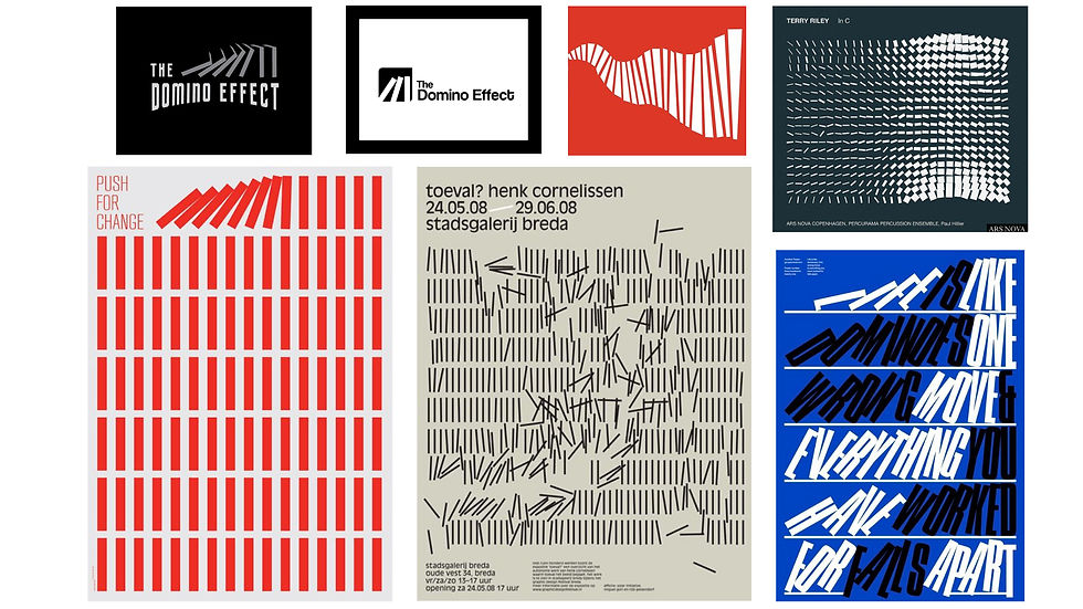
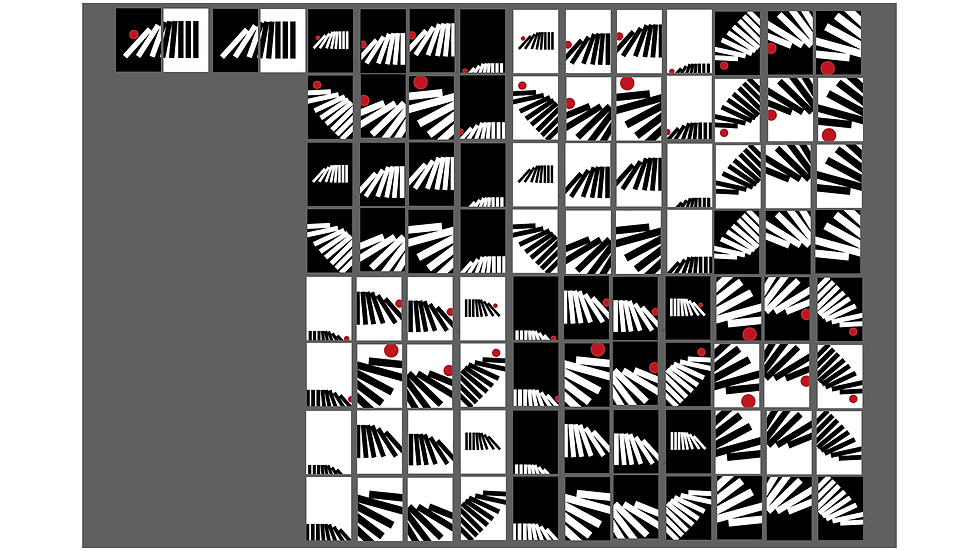
Domino visual
False advertising
Execution:
Insight 2: Behaviour can be defined by a reaction to external stimulus
Idea: - visualise action and reaction
kinetic typography/ graphics
Stop motion with type/ playdough
Execution:
Insight 3a: Most people are unaware that they are being intentionally manipulated to change their behaviour.
Insight 3b: People are more predictable than they believe.
There is an illusion of self control.
Idea: using copy that intrigues to “wake people up” and become more aware.
(You are being manipulated) (wake up)
Execution:
Using data
How light and sound can be created a fabricated space that can change behaviour.
-People are constantly being studied by businesses. (what sort of imagery comes to mind)
Idea: manipulation, “do you know are being manipulated?”
“Nudge” to wake up
People like to feel special, unique. Make it seem that coming to the event is unqiue and different, “exclusive”.
VISUALS - HERD, MASSES OF THE SAME AND ONE DIFFERENT ( PHOTO OF MAN SMILING IN TRAIN AMONGST RUSH HOUR)
“Forget about reality about their daily routine and everyday scene
So that they can be transported to a different psychological space
Using light and sound to augmented space and created a fabricated reality and we do this to challenge our perception of things, things that we experience in our everyday life that we perhaps take for granted.”
Motion graphic video - reference a feast for the eyes offftlv
Potential deliverables to think about :
Passes
Wrist bands
Podium
Banners
Merchandise
Good behaviour
Bad behaviour
Playful Identity
Illustration style
We are currently looking at how technology has already altered our behaviour, we could try to imagine and dramatise how it’s going to affect us in the future.


Upon pitching to Brian, he asked us what our favourite route was and to justify which route we would like to take. The idea we liked was the third idea based on communication but we didn't feel like it was we had good visual representation for the insight. He asked us to sell our idea and we did not feel like we knew the idea well enough to sell it.
We then went forward to doing more research into the insight and idea and see how we could represent it in a different way.


After the final pitch to class, we got good feedback from Derek and Steve saying they think our ideas were strong. Derek thought the Domino Effect idea was the strongest and that it was visually strong. He said the type used for the poster was definitely not right for the image and that we should use different type. It was stated that the communication idea was a good activation but not good for visual identity.
All of the ideas we then put into a vote for the class and our Domino Effect idea got the most votes.
Derek then took the top 3 voted and chose the idea to run with and unfortunately our idea did not make the cut but made a close second.
I voted for Diana's Butterfly Effect. I liked the insight and the work she created. it was a similar insight to the domino effect i created and it had good logic and research to the idea. She designed it to look professional with good mock ups and it was further produced that my idea. She got chose for the conference and rightfully so.

We then decided to expand on the Domino Effect idea and create some mock up for how it would like in a conference setting.


We then decided on activation's for the conference. An idea i come up with was a chain reaction drawing. Using all the visitors to draw on a sheet and create a continuous piece of art throughout the night. Another idea we discussed was a ball pit filling up a ball pit throughout the night and creating a change. Seeing if we could get people to throw a ball into a pit with an incentive.


I attended the Creative Conscience Conference on the 7th Feb to get an understanding of how a conference is run. I wanted to see the branding, organisation of the speakers ie time and the layout of the walker space I liked the aspect of circle tables making the visitors feel comfortable and. The time was well organised but wasn't strict enough. They had no leeway for speakers incase they run over and ended up behind schedule.


Overall i enjoyed this project a lot. I felt good working in a team with Sid and Jacob we gelled well together creatively and i am happy with the work we produced. The conference branding was a different experience to what i have done before and was good to see the process of planning a conference. I look forward to having our conference in the next term and seeing what we could do or have done better during the time.
Comments