
Website Development
- Mar 20, 2019
- 3 min read
Updated: Mar 21, 2019
Once I felt I had my visual identity of my website I started thinking about user experience.
How does a user go from one page to the next?
How does a user work out what a symbol portrays?
How does a user use a promotional code they have found?
How does a user then get to the place in Bermondsey?
My main goal of the website it to make people go find these hidden spots, to feel as if they have uncovered a piece of treasure through searching through a functional puzzle type website.
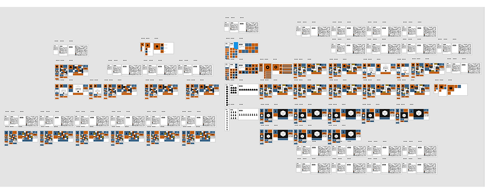
I decided to make more symbols to improve my user experience.
How does a user go back to the page they originally came from?
Wherever you are in the website, you can always go back to the previous page by clicking the main icon in the top left corner of every page. hidden arches page to go back to the homepage, or back to the tourist spots page to go back.

I designed more symbols for my website for the main page. A symbol for a key page to work out what the symbols are, a symbol for travel, a symbol for events and a symbol for a sounds of Bermondsey page.

I went on to designing a map to suit my area, i went for a black and white colour scheme to fit the brand identity.

I designed specific symbols to fit in the boxes of my hiver's taproom page giving clues to the person as to what the place is, adding honeycomb pattern, a bee pattern, a barrel and beer.
On my Hiver's Taproom page I decided to give the user hints and clues hidden within the boxes of the design. If you click on one box you receive the name of the place, if you click on another box you recieve an events page, which you can then move forward into an events page for hiver's taproom and finally a promotional code, which then can take you into a separate page where you can download to a tablet or phone to show the bartender a promotional code to tick.
I also wanted to incorporate reviews into my design, so i used a box at the bottom which if you click you get direct reviews telling you about the place but don't reveal the name.


Thinking about how a user can find the hidden place i added a GPS code, which can be copied and pasted into a map page to find the location of the spot.

Moving forward from this i developed a page for the 'White Cube', using the same context, then 'The Fashion Textiles Museum' and a hidden bakery called 'The Little Bread Pillar'.

I prepared my full website on to Xd to present to Derek and Visit Britain. I got positive feedback, a few things I needed to take on board was the visual identity with too many black lines and the symbols being quite inconsistent. I was told to think about my audience and it being more aimed towards the sophisticated artisan people of London and making it feel more like a piece of art.
I feel the feedback I got was spot on and will help me to improve my visual identity and user experience.
I went on to redesign some of my symbols, sticking to 4 main symbols for the homepage in a simple block style and more illustrated symbols for the business pages.


I redesigned my pages by removing majority of the black lines, but still keeping my Camille Wallala inspired style.

I also decided that my home page would change each time you clicked back on to it


Comments